Critique of a Chart
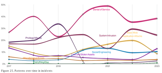
Up above, is a graph I found from Verizon’s 2023 Data Breach Investigative Report, which can be accessed at: https://www.verizon.com/business/resources/reports/dbir/2023/introduction/ It’s a graph that shows which types of data breaches have become more or less common over a span of six years from 2017-2023. The types of data breaches listed and categorized in the graph are “denial of service,” “privilege misuse,” “system intrusion,” “basic web application attacks,” “social engineering,” “lost and stolen assets,” “miscellaneous errors,” and “everything else.” There are some pros and cons I have discovered about this graph:
Pros
It looks at the fluctuations in the amount of a particular data breach over a span of months per year based on monthly averages instead of over a span of days or weeks in order to fit all the data into the small space that the graph covers.
It ensures that the viewer and reader of this graph is able to distinguish which line refers to a specific data breach category by matching them based on color.
Cons
Using colors is not necessarily the best way to separate the lines from each other and match a specific data breach category with a specific line. It cannot be assumed that everybody has normal color vision. There are too many cool colors, especially green, blue, and different hues of purple that make it hard for the eye to focus and differentiate the lines from each other. On the light spectrum, the human eye can see the colors green pretty well and the color red fairly well, but not the color blue. We have fewer cones in our eyes that pick up the color blue and, as a result, have to focus more on texts and details that are in the color blue or blended in with a blue background.
The text of the data breach category “basic web application attacks” is in a bright yellow color that can make it hard to see and read.
The best solution for presenting this graph is to either incorporate some more warmer and brighter colors to provide more contrast and differentiation between the colors to help the viewer and reader distinguish which line belongs to which data breach category. Or, create different types of lines such as dotted and broken lines, for example, which I recommend, instead of colored lines.